Project - Login Page Adjustments
Topic: Request for a new login option (+ login page redesign)
Introduction
In this project the company wanted to update the login page for their SaaS product.
As the user base expanded, the request for more login options arose. New customers usually already had one prefered login option and also wanted to use it for their login to this company's product.
Problem
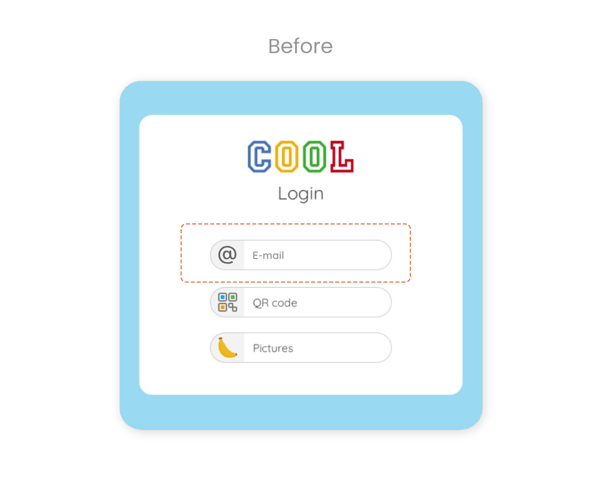
Initially the existing users only neededed to type in their e-mail address to access the platform. These customers mostly used Google. As the user base grew, new customers requested additional login options, such as 'Microsoft'. The company decided to grant this request and offer SSO solutions for Google and Microsoft. The challenge was to add a login with Microsoft whilst not confusing existing users, who up until that point only had to click on 'E-mail login', as well as making it clear to the new Microsoft users which login applied to them. The plan was to make an easy distinction between the options in the naming, since most old users were not aware what service (Google or Microsoft) they used.
Solution
Step 1
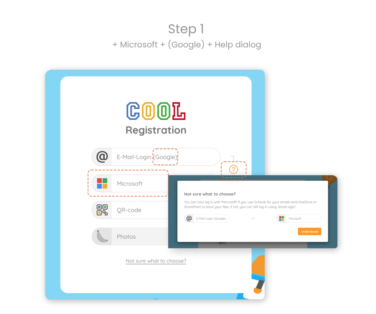
After the Product Architecht had concluded his work in regards to technical solutions, the design team got to work. It was decided that in place of an e-mail login two single-sign-on solutions would come into play.
The most efficient way to do this was to simply add 'Microsoft' as a login option to fulfill the new customers' request and change the name from 'E-mail login' to 'Google' (This would have techincally worked, because old users did login with Google e-mail addresses).
Not confusing existing users was one of the main concerns, since the user base largely varied in age and technical abilities and literacy. Therefore the idea was to keep the name 'E-mail login' and add "(Google)" to it.
To help the distinction even more the icon of the original login was swapped for the Google icon.
After some time the first part would be possible to ommit, since all users would have understood which button to click.
An explanation of the different login options was added as well to provide more clarification for those in doubt of what option to choose.
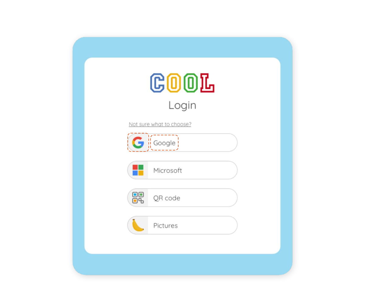
Step 2
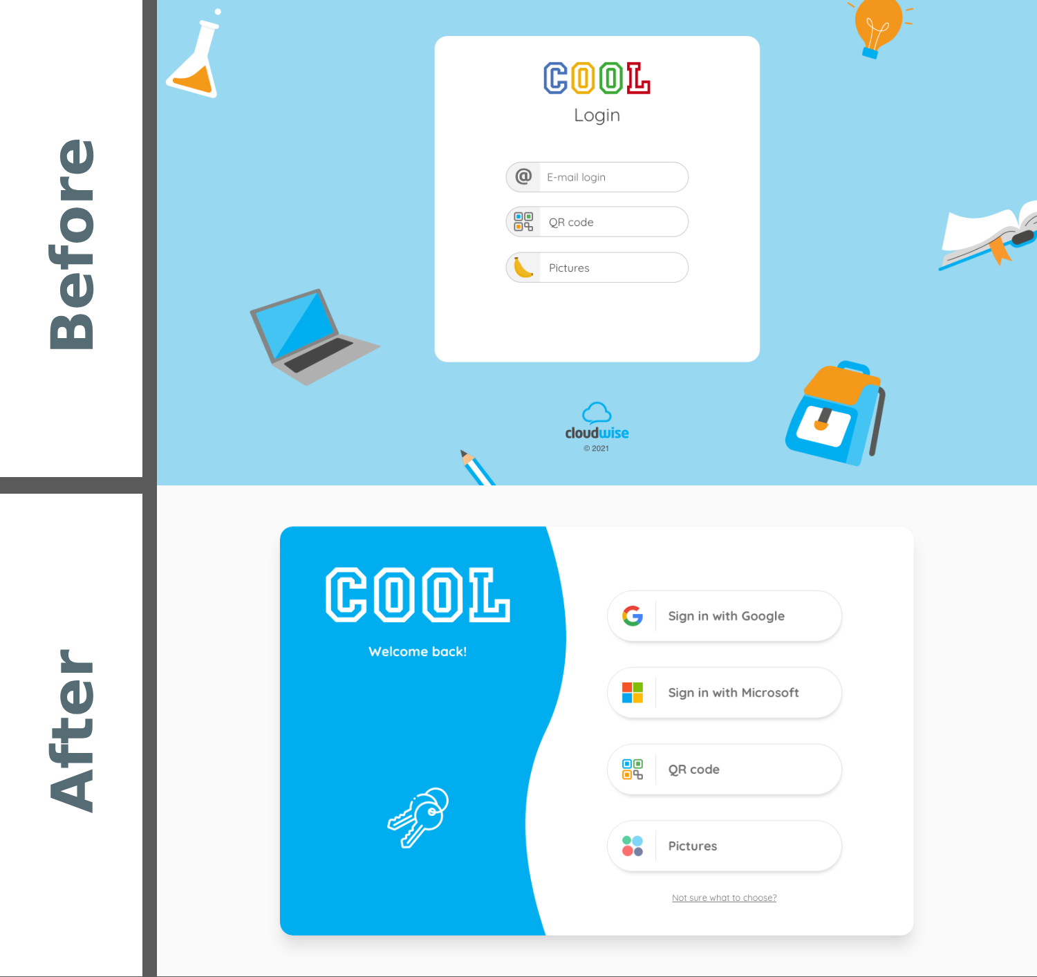
In the long run the goal was to change to clearly named SSO login options. In addition to that the whole design of the login page needed a visual update. This redesign would also include animations in the frotend and structural changes in the backend.
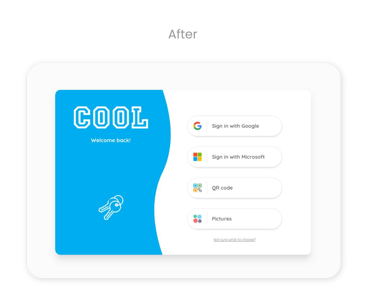
See image titled 'After'.
Final Thoughts
Ideally, as part of the design team, I would have preferred spending more time on research and user feedback. However the business needs and deadlines had to be taken into consideration. Skipping straight to the new design of 'Step 2' might have been the prefered option, but the technical implications would have been immense.
Not only does the design of 'Step 2' include challenging frontend changes, such as animations, but also big backend logic adjustments.
As a team we decided that in order to satisfy both old and new users, it would be best to make minimal changes to the original design and release a complete makeover of the login page at a later stage. In an agile environment this gives all teams more time to research and plan, as well as ease the users into the design changes.