Data Analysis Tool - Complete Design
- Timeframe: 10 months - first launch after 4 months
- Design tasks: Product UI/UX, Website, Marketing
- Tools: Figma (UI + Prototypes), ClickUp
- Contents: User flow, Wireframe, Moodboard, Design system, Onboarding, Editor, Final thoughts
Laying the foundation
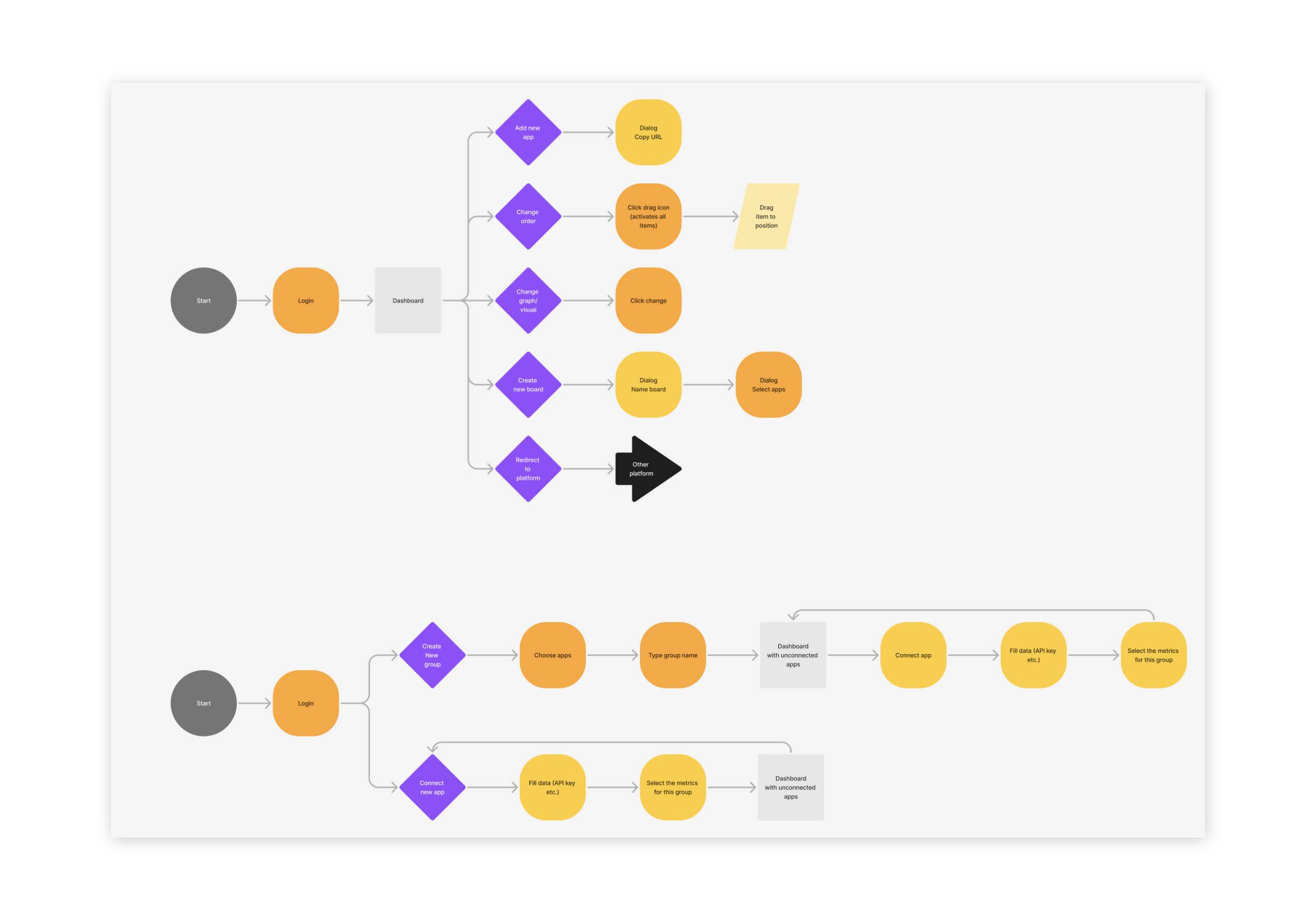
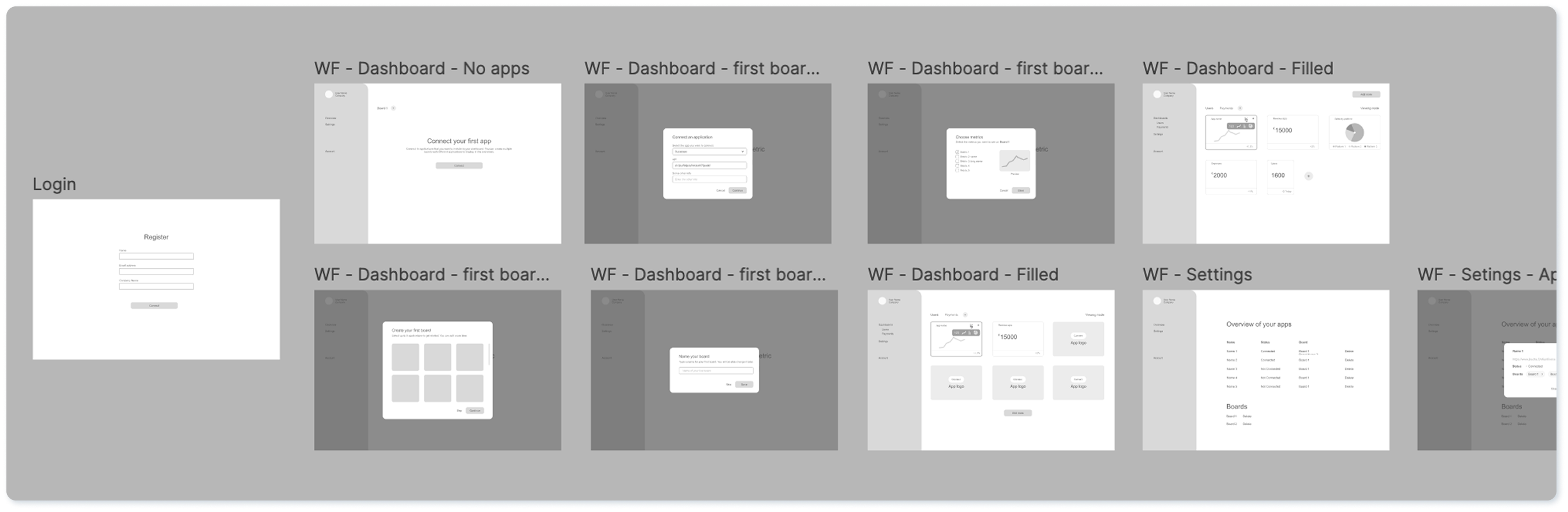
This project came about as a joint effort with the other co-founder of ZapDigits. We started with a clean slate and had no design or code whatsoever. My part in this has been everything to do with the design aspect of the project, from website to product to marketing materials. I started out with different user flows and wireframes to possibly bring our ideas and thoughts to life. After the first feedback loop it was time to gather inspiration for shapes and layouts on a moodboard.
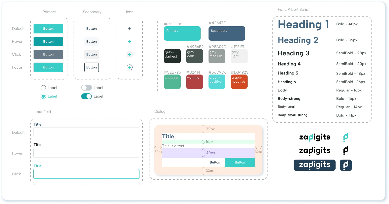
Creating the design system
Using the colours and shapes I gathered on the moodboard, I was able to create the beginning of the design system. Not all elements were ready and developed from the get-go, but the main components were there and could be used to start building the UI. Overall we planned to keep the design clean and simple, since it should be easy to use and keep the focus on the graphs with the users' data. Therefore we settled on mostly white backgrounds a distinguishable primary colour, a subtle secondary colour and a sans-serif font. Objects such as cards and buttons were given rounded corners.
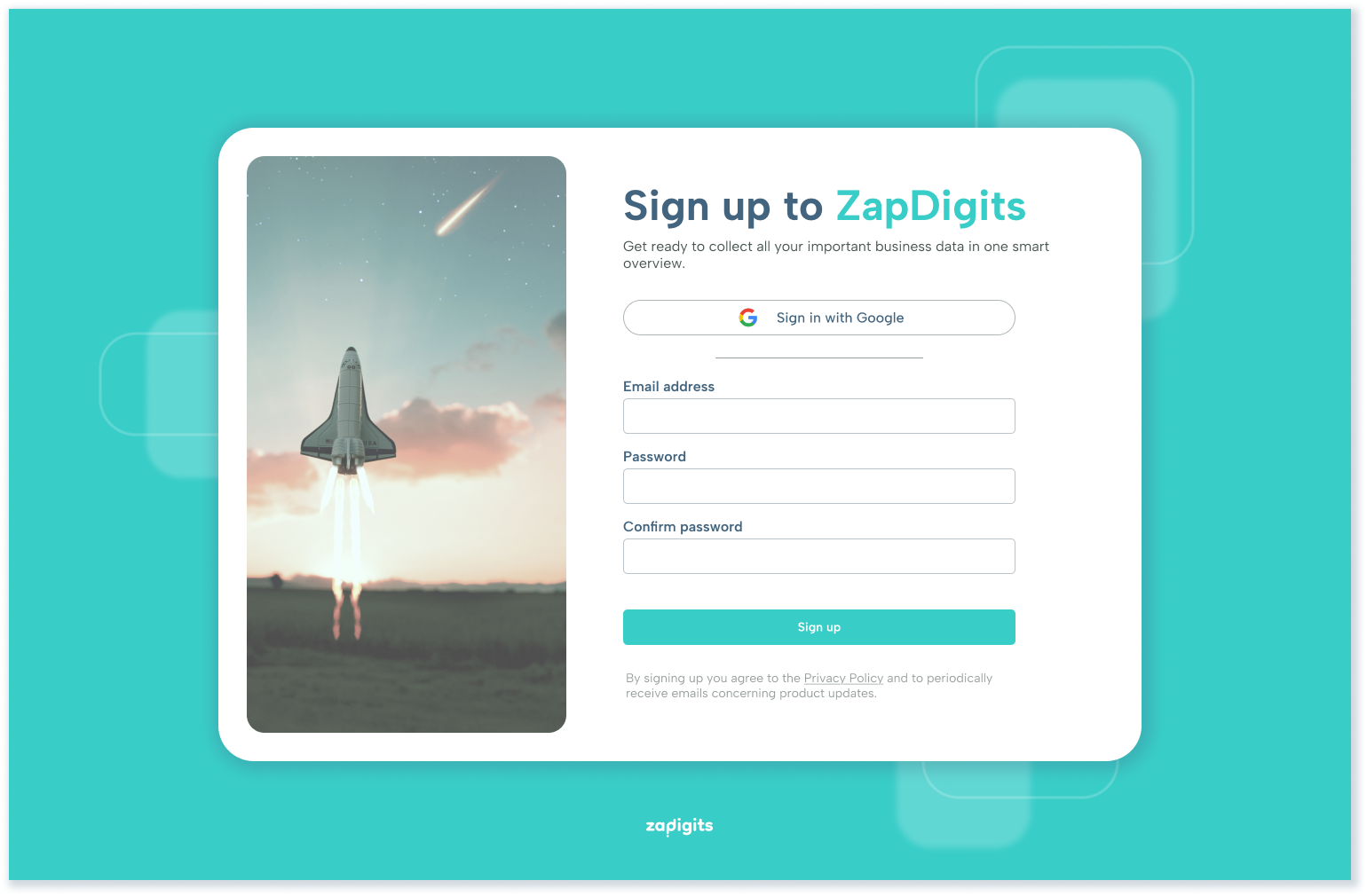
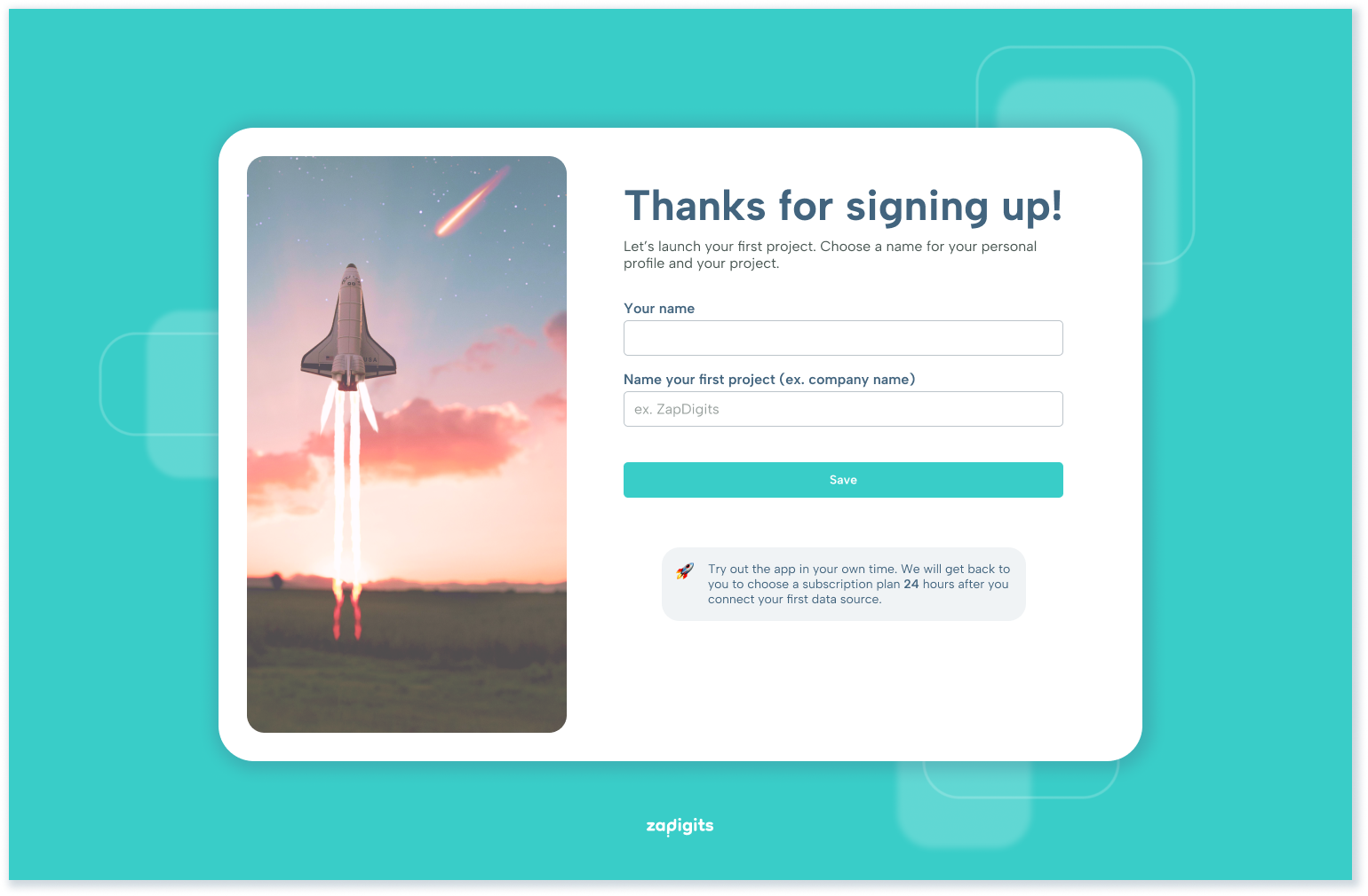
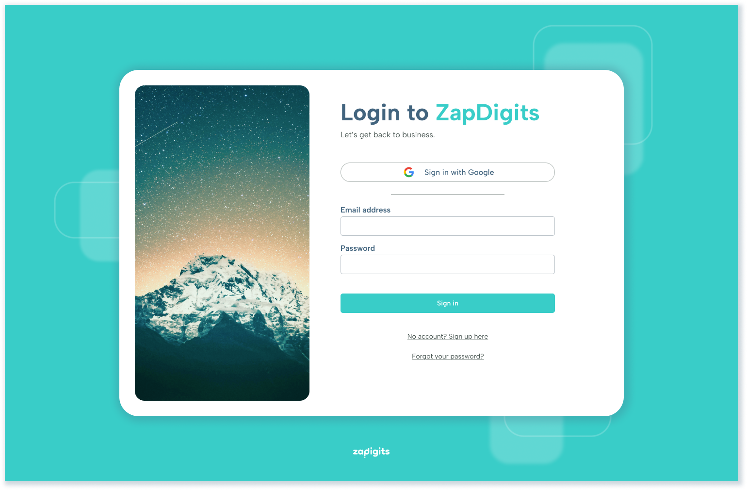
Onboarding flow
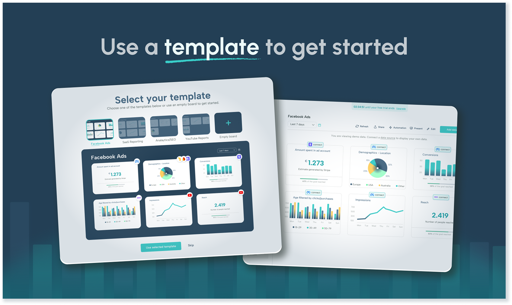
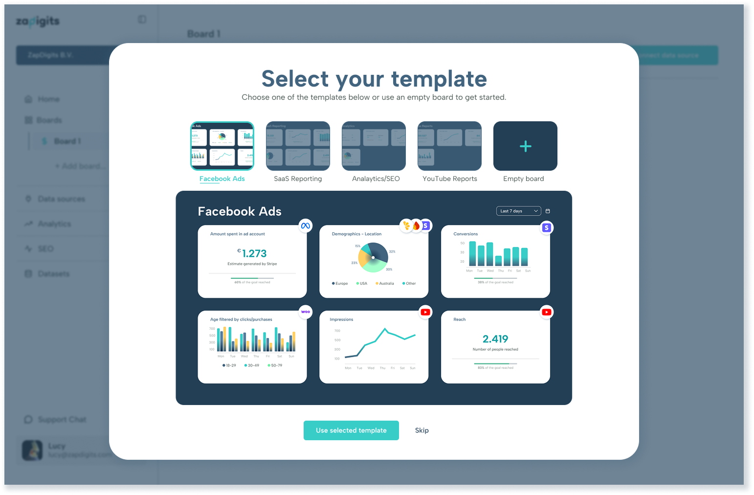
In order to create a simple onboarding flow, I chose inviting yet non-distracting imagery and only asked the most necessary information. Google SSO was added as a quick and easy login option. In the second screen some user info is requested to set up the profile and project. Along the way other elements were added to the onboarding flow. In the beginning we decided to incorporate a pricing overview into the onboarding flow and replaced it later with a template selector. The pricing overview was especially important for the launch of the project, but could be omitted later on, whereas the template selector continues to be a useful tool to help new users get started easily.
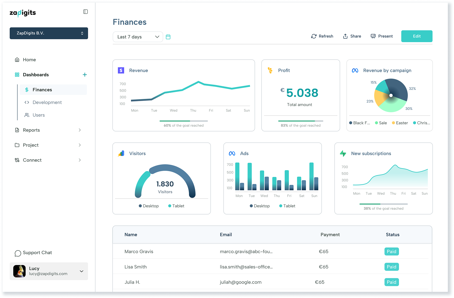
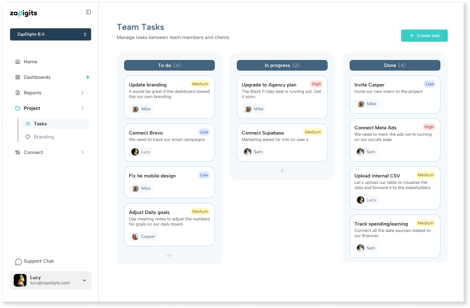
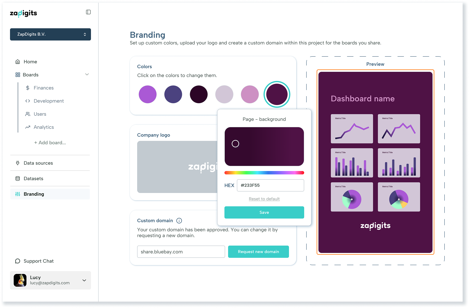
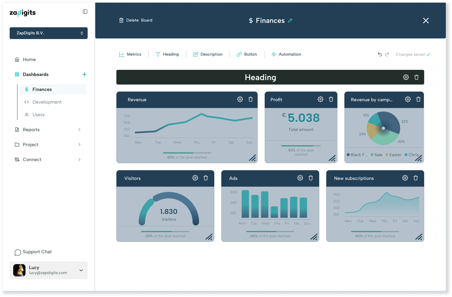
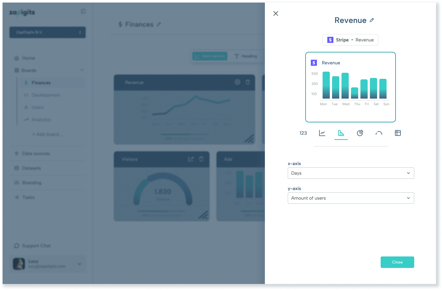
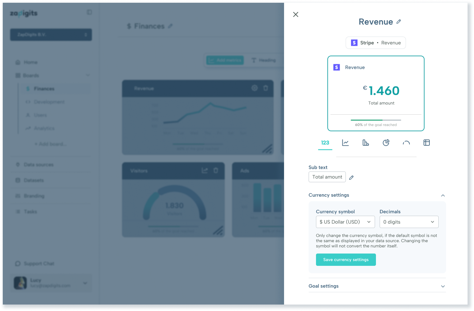
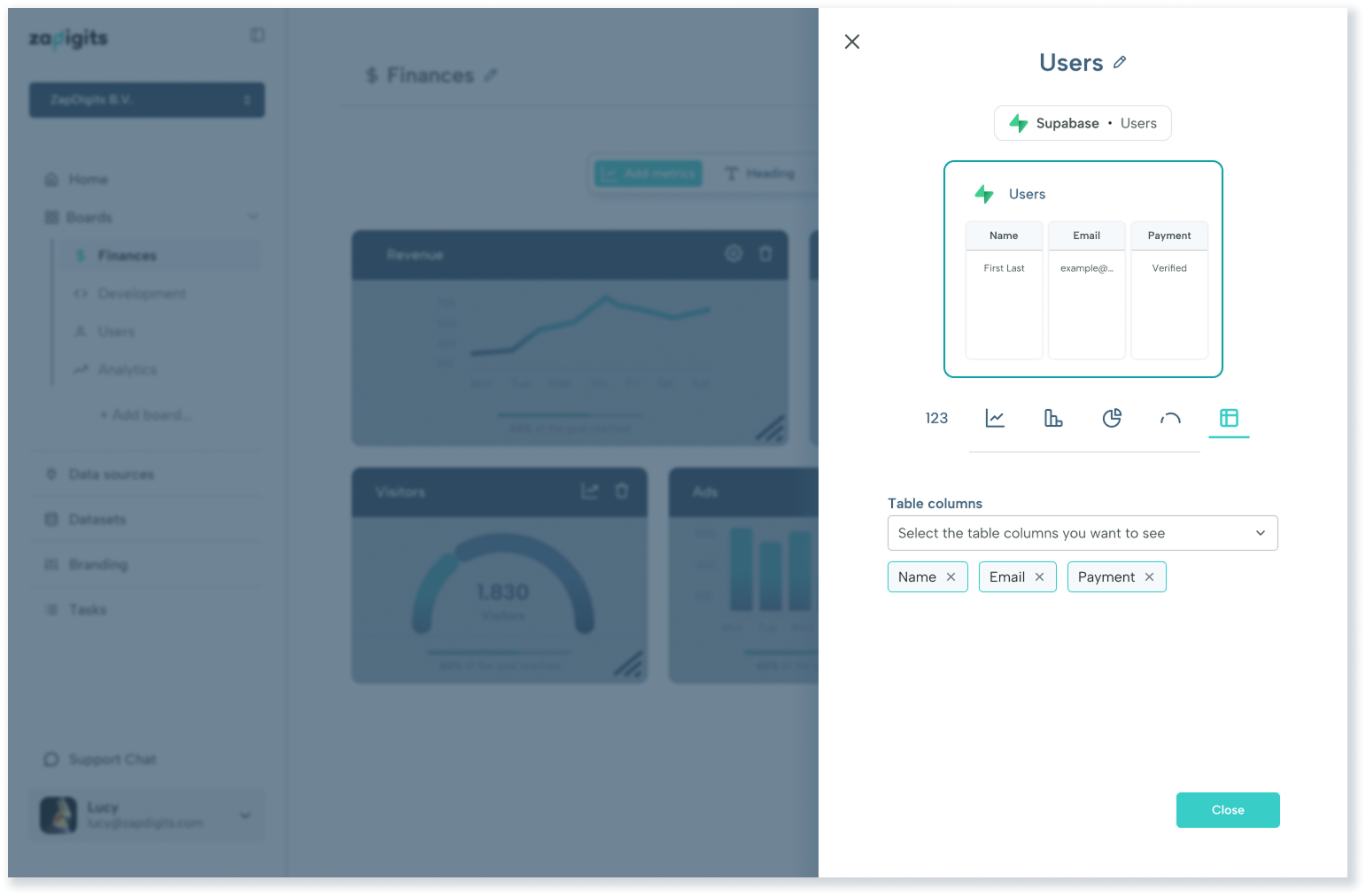
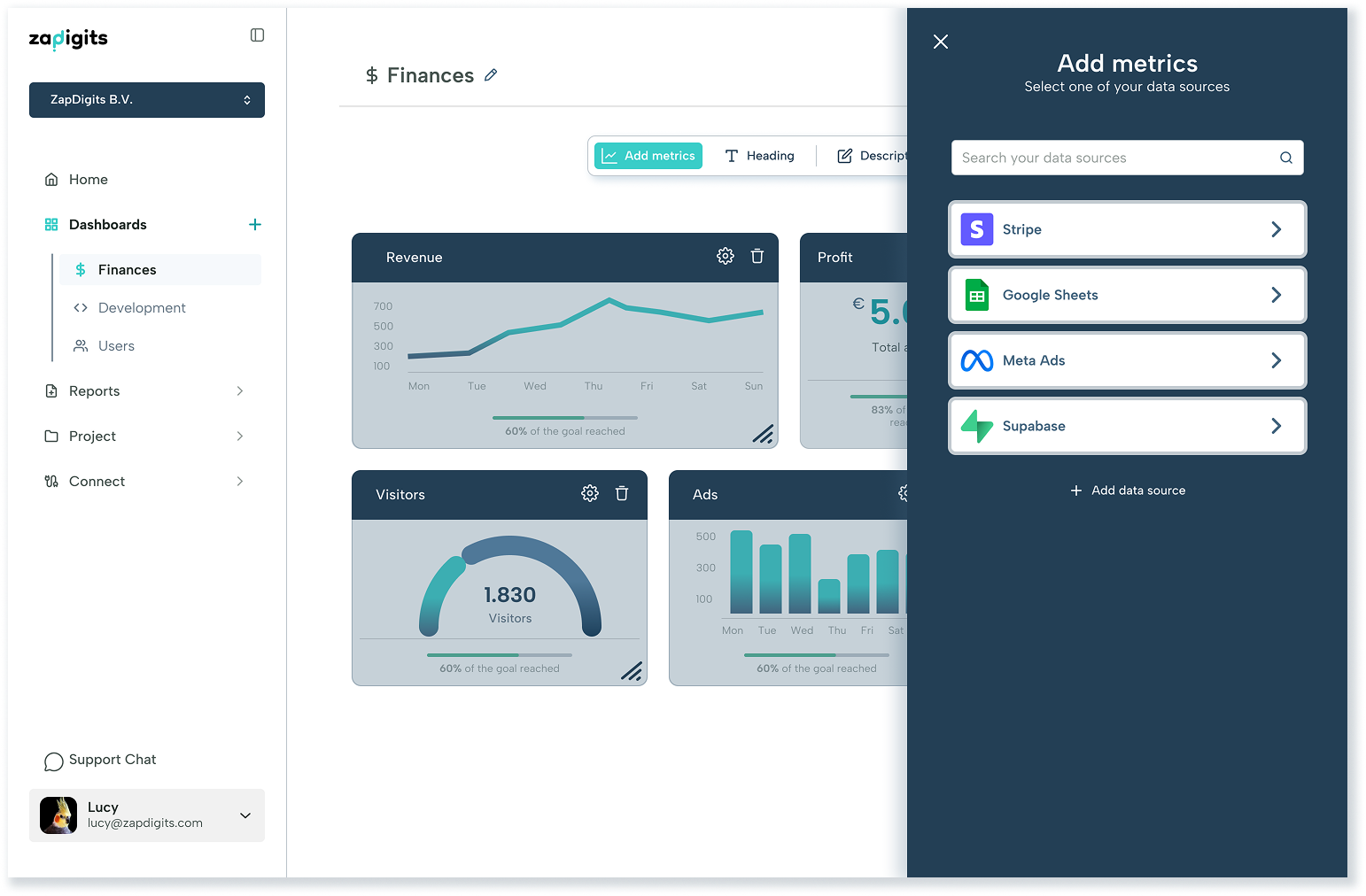
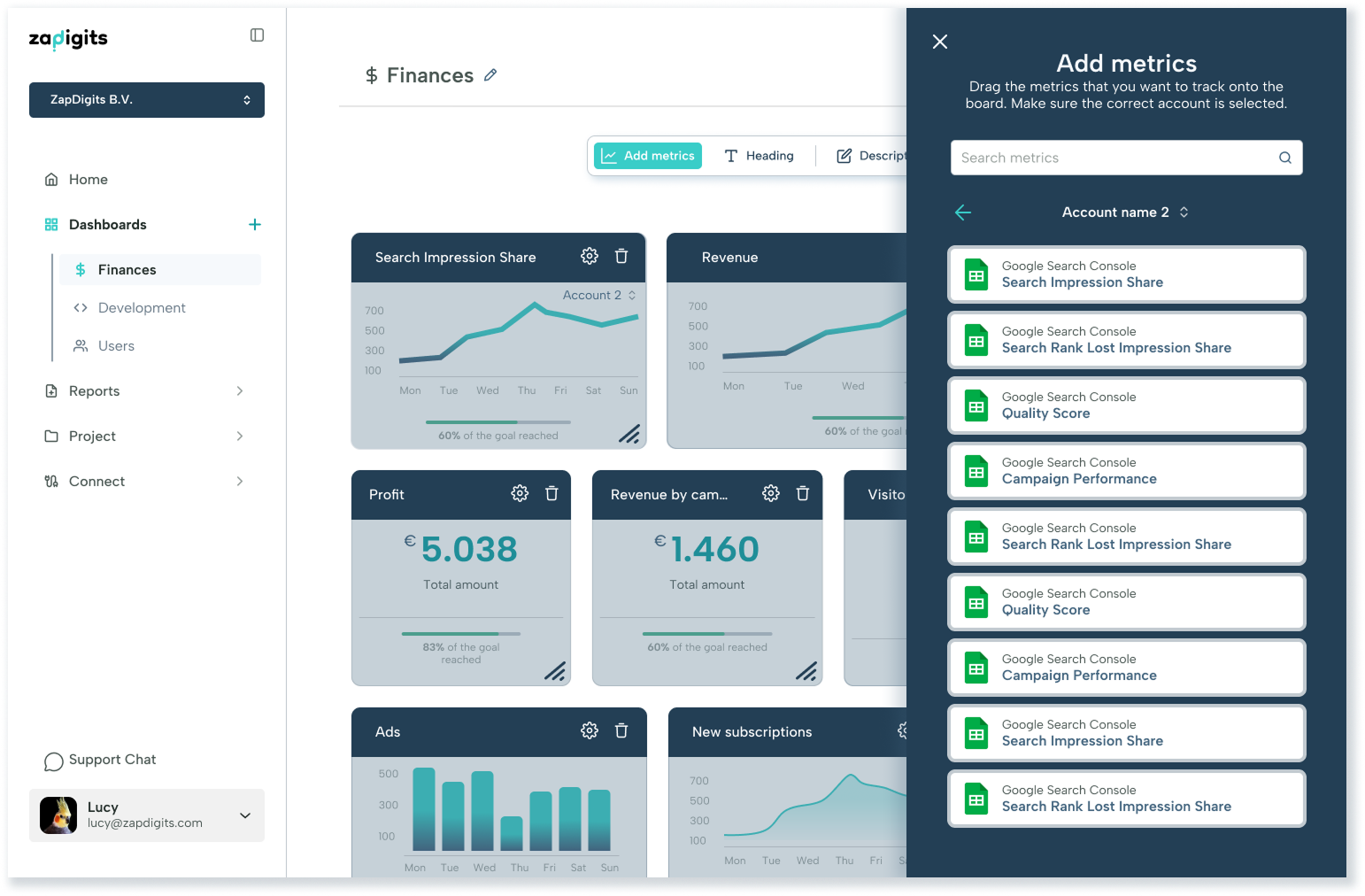
Feature example: Editor
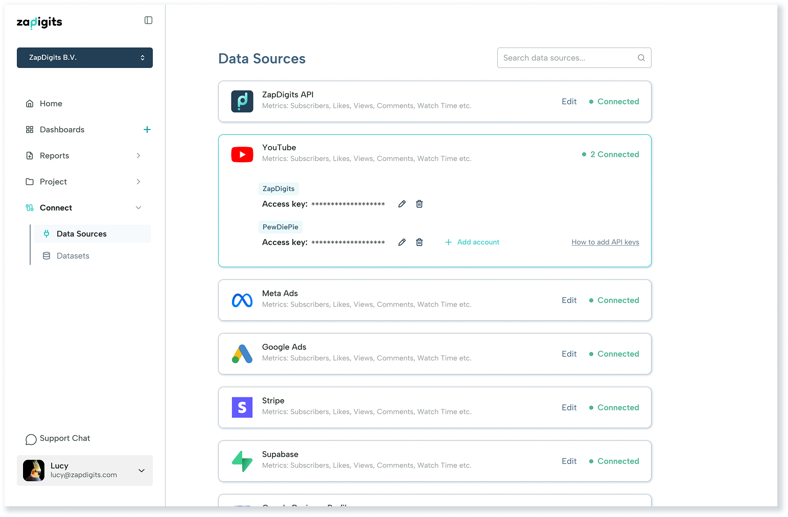
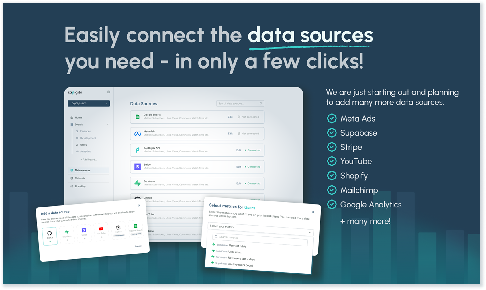
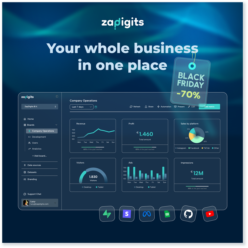
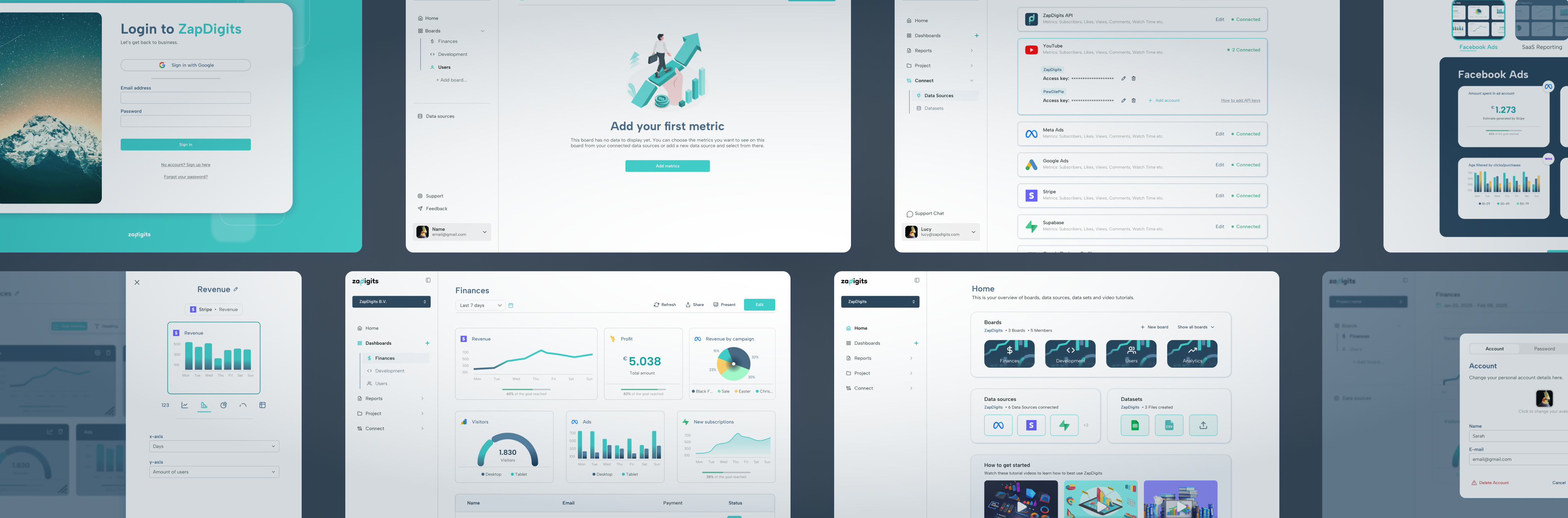
There are several features within the product, for example Branding, Team Tasks, Reporting, Analytics or Datasets. Below I am focusing on the Editor. As the main function of this product is the creation of dashboards from various data sources, we wanted to make sure this feature goes into detail. Depending on the customer and dashboard a user might want to add headers, textfields, buttons or create email automations to share the data. The main use however, at least when setting up a board, is the metric selection. These metrics derive from the data sources a user connects and can be customised to a certain extent.
Final thoughts
This has been a big project and a lot of work. By now many features have been implemented, but we went about it in a smart way and started off with only an MVP. The struggle was to decide which data sources to make available at first, since competitors already had hundreds to choose from. Being in the beginning stages of our product we were only able to add a handful at first.
After the first launch on ProductHunt we were able to gather feedback, pique interest and decided to work on improvements and requested features and data sources.
Doing this allowed us to do a second launch via a marketing company, where we got evene more great ideas, users and requests. One thing I am happy about is that although there was a lot of valuable feedback, nobody struggled with the UX of our product and a few people even complimented the clean UI.
The UX was sound from the beginning and it paid off that we spent effort on creating a simple user flow and kept modern UI and UX choices, that people were used to from other platforms, in mind.
In some parts we made the choice to adjust the user flow. One exmaple would be the onboarding, a very crucial step for any new product. It was important to keep it as easy as possible, whilst being intriguing and and finding a way to showcase our distinctive product.
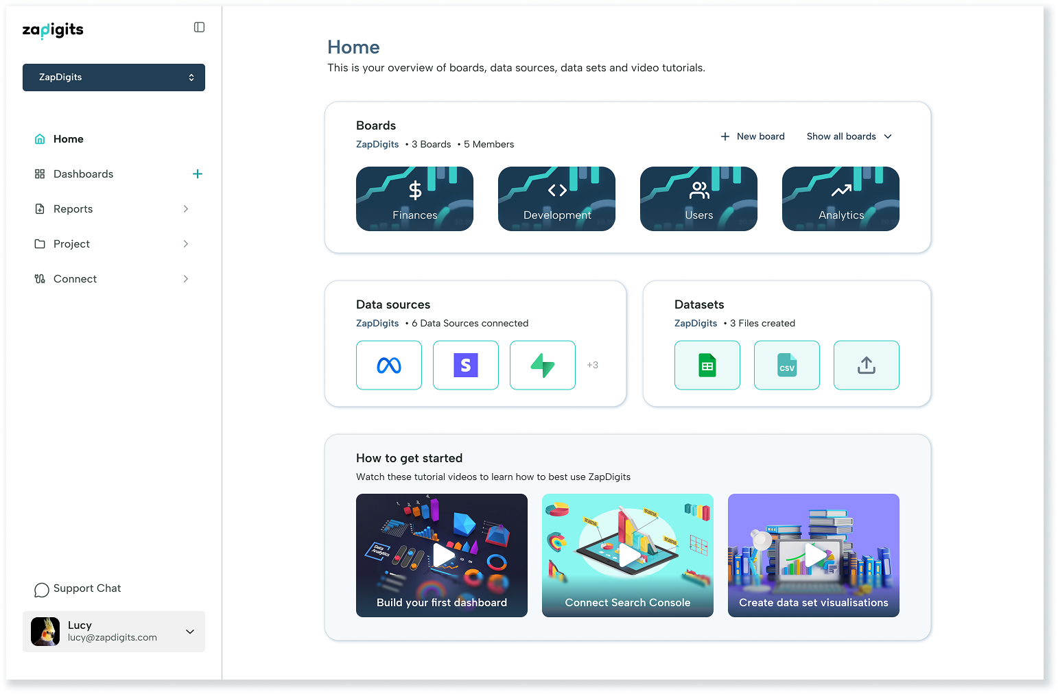
Another example of design choices that required adjustments would be the sidebar navigation. This was necessary due to an increase of features. The product started out with only the Dashboards and Data sources as menu items, but soon were joined by Overview, Datasets, Analytics, Tasks, Branding and Reports. In order to declutter the sidebar and make the navigation easier, we decided to group menu items and make these groups collapsable.
As for the future, one big UI project on our roadmap is darkmode and I am sure there will be more adjustments to the Design system as well as the UI and UX.